More striking. Clearer. Simply better.
The new ATE packaging.
In the case of a traditional brand like ATE with a history of more than a hundred years, the product range will continue to evolve and grow over the years. Many innovations have paved the way for our growth, but when it comes to packaging, we’ continually relied on the tested & tried designs.
However, we realised it was time to give the brand a more modern and uniform appearance – so we revamped our ATE packaging and also took the opportunity to restructure and optimise it.
So, what’s been changed – and what hasn’t?
When developing the new design, we wanted to retain the brand’s distinctive character while communicating the aspects of quality and innovation even more clearly.
This is why we’ll be retaining the striking ATE blue – but making it even more prominent.
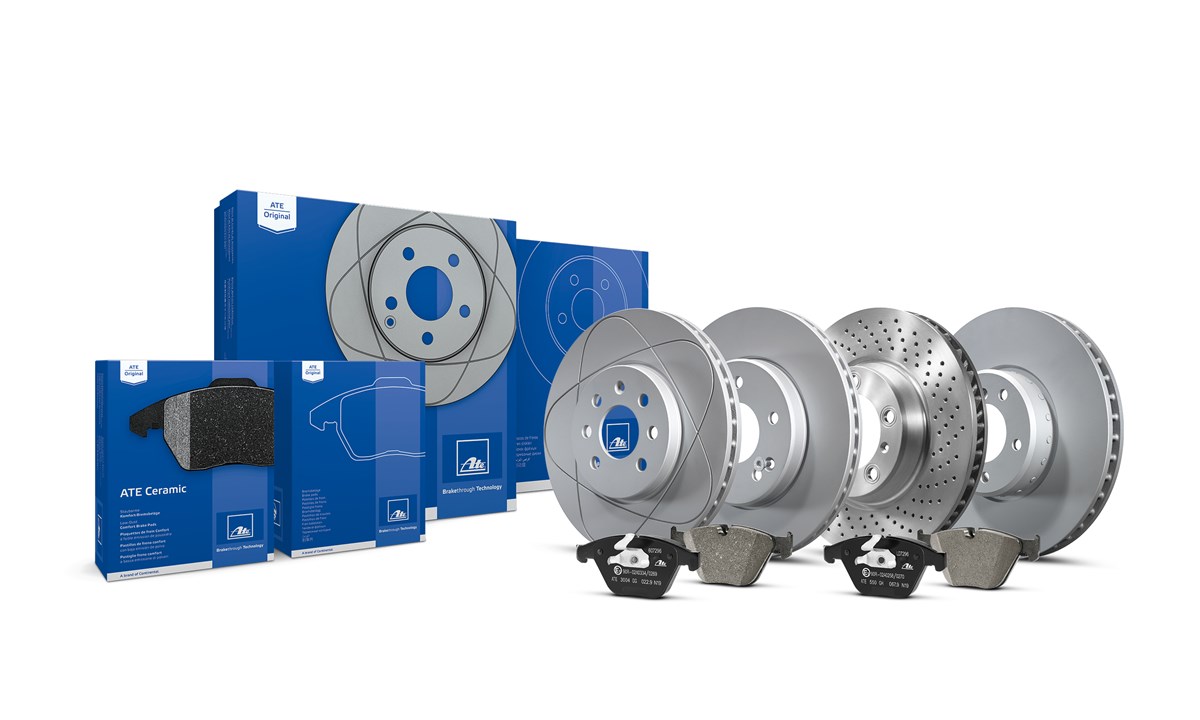
The packaging has also been perfectly matched to ATE’s product range. Product categories can be distinguished from one another even more easily – and innovative product highlights, such as our ATE Ceramic brake pads and the ATE PowerDisc, will be given a particularly prominent appearance with a product image on the packaging.
We have also improved the packaging itself and defined uniform standards within the categories. For example, the material composition of the packaging for brake discs has now been optimised, as has the printing process.
Your advantages:
- A clear and uniform brand image
- Easier differentiation of the products and product groups
- More visual definition throughout the entire product range
- Improved, uniform packaging quality
The packaging of one product group after another will be changed, so you’ll find both old and new packaging on the shelves during the transition phase. However, the package contents will not be changed – the ATE products in the box will always retain their usual high standard of OE quality.